
After deciding on my final idea for the practical work for my CoP I tried to look for some interesting designs that show off logo designs.
I found this very interesting project on Behance were he experimented with how far he could expand a logo before it becomes unrecognisable. I found this fascinating because it tests our recollection of these logos to the extreme by seeing how little of the logo we actually need for it to become recognisable.

https://www.behance.net/gallery/6546453/BIG-BRAND-THEORY-Experimental-Packaging-Design


The effectiveness of these cans is surprising considering that all that has been done is to crop the logo closer than you would expect. The effect makes the cans look really clean and contemporary, removing all information on the can but the logo.

I also really liked how he has rated the cropability of each of the logos. It just goes to prove that if a logo or brand is advertised enough for it to be common within our society then people will be able to recognise it down to the shapes and colours it creates.

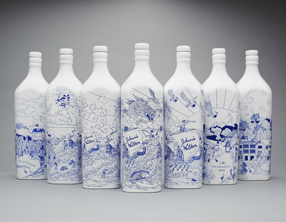
I found that the simpler the packaging is in terms of layout and colour scheme the more effective it looks. Like in this example where they have simply filled the cup with the text, just in a monochrome colour scheme, compliments the hand-drawn elements. It feels like someone could have just sat and doodled it all on the cup making it feel a lot more personal to the consumer. I think this sort of style to the packaging would be really effective on my design due to the differences in typography, compiling them together would give subtle contrasts.
No comments:
Post a Comment