I feel like I have struggled with Context of Practice this year. I am not sure whether this is down to the question that I had chosen for myself or the subject matter. Towards the end of the essay I felt uninterested by the topic. It has certainly made me realise which aspects of graphic design I enjoy the most.
When it came to the practical I feel that I let myself down as I struggled coming up with a good concept. I aimed to make something that was quite experimental yet I think that my final outcome is far from that. For the final result I created packaging because this is what I enjoy doing the most, yet I twisted it to fit my essay. I am not sure whether it successfully portrays the idea of the ubiquity of a logo. Also because I was so indecisive about what to do in the initial idea stage I felt like I lost a lot of time that I could have spent further developing the designs that I had to create a much more engaging campaign.
Though I may not have enjoyed writing this essay I feel that my writing and researching have improved from doing this essay. Also I realised the importance of feedback within the module in order to keep on track with both the designs and the essay itself.
My time management through out this brief has been good though, I managed to reach all of the interim deadlines. A part from perhaps the draft submission deadline in which I didn't have enough words but I felt what I submitted was of good quality.
Overall though I am pleased with my essay as I feel that I have explored some really interesting topics and challenged my original perceptions of logos. I feel like I could have explored the principles of logo design more however I enjoyed exploring other aspects.

Monday, 25 April 2016
Sunday, 24 April 2016


Saturday, 23 April 2016
OUGD501 - Final Poster Designs
These are my final 4 posters showing off the campaign celebrating 125 years of Coca Cola. I am really happy with how professional these poster look especially when put into context. I feel like they represent Coca Cola’s values as well as showing the consumer that they indeed are a part in their success.
If I had more time on the practical I would have liked to do a more widespread campaign emphasising the logo. Like I mentioned before perhaps with some sort of motion graphics to further advertise the campaign.


Wednesday, 20 April 2016
OUGD501 - Practical - Digital advertising
As well as having some printed posters for billboards and other places, I thought that creating some advertising on digital platforms would be beneficial to emphasise the saturation of these branded advertisements within our society.

Using peoples interpretations of the coca cola logo from memory I created a gif compiling the best ones. Here this is trying to portray through the use of the personalised versions of the Coca Cola logo that whenever you drink it, you drink it your way. Kind of putting the ownership in the hands of the consumer.

Additionally I wanted to promote the create your own bottle design feature on their website so I asked some of my friends to design some bottle designs that could have been made using this tool. Once again I simply animated this in a gif to use for advertising on digital billboards or on social media.
Monday, 18 April 2016
OUGD501 - Practical - Create your own bottle Feature
Because of the nature of the designs that I am doing I thought that as a sort of promotional feature for Coca Cola customers could create their own bottle designs to have for themselves. This shows people's recognition of the logo and how well it has been ingrained into our minds this would inadvertently advertise Coca Cola. I thought that this would be perfect to advertise an anniversary of the creation of coca cola. Conveniently I found that the 125th anniversary is next year so I could use this.

Initially I started by designing a little set up for users to create themselves a limited edition bottle. I tried to follow a similar layout to the current Coca Cola website but I found that it looks a bit strange and empty.

I found the website for the actual drink Coca Cola rather than the overhead website for the company and applied a similar style to my site design. I feel like this is a lot clearer now for users as it is easier to navigate.
I also mocked up an enter page for the website to further advertise the limited edition bottles. With the use of this digital platform, what I have talked about in my essay that logos become common through saturation will ring true.

Saturday, 16 April 2016
OUGD501 - Practical - Poster designs - Your Coca Cola
For the poster designs I wanted to keep them very classic to the brand of Coca Cola itself, keeping all of their signature colours. Perhaps even to make them look like they could have appeared in any time period within the last 50 years.
I started with some of the limited edition bottle designs that I had got some friends to design. Taking inspiration from previous Coca-Cola advertisements I went for a minimal gradient background with text and simple imagery over the top as to not add any excess ornamentation. Although I felt it to be a little too plain and not as inviting as I would like it to be.

I changed the font to be more friendly, by using a sans serif with wide open counters to invite the viewer in. I also made the product a lot bigger on the poster, so that it overlaps the logo a bit to show off the product rather than the logo. Also I thought I should add a feature to the bottle to show that it was limited edition and what it was celebrating. I added a small bit of extra information too to further advertise the cause of these designs. I feel that with the bigger bottle and change of type the over all aesthetic looks a lot more professional, though maybe not timeless.

After deciding on the general designs of the bottle posters I moved onto the can designs. I wanted to get both versions of the can design onto the poster as I felt that they were both relevant. However in this position that I placed them in they feel oddly placed. I think that they should probably be interacting with each other in some way to make the poster a lot more inviting.

To make the poster look a lot more dynamic I changed the positioning of the cans and I feel like this has made the whole poster look a lot more visually pleasing as it give the eye somewhere to look towards

Friday, 15 April 2016
OUGD501 - Practical - Bottle and Can Wrap designs
After getting people's interpretations of the logos I decided to start mocking up some can designs for the campaign. I decided to make it more personal to the audience and to relate to the fact that the sketches are each unique and individual I added the strap line to be "your Coca Cola" in order to further relate to the consumer.

After some initial feedback I tried some different colours to the usual Coca Cola logos as well as playing around with the placement of the sketched logo. To me these colours are a bit jarring, while they add a sort of friendliness to the cans they don't feel like Coca Cola cans. They almost feel like knock offs due to the colour scheme being different. Also I much prefer the simpler designs to those which stretch across the whole can or go horizontal. I feel like for the can designs the simpler they are the more successful they will be. Additionally I tried to compile all the logos together like in the packaging designs I found for my research. I feel like this is quite effective at making the can seem personal however the colour of it makes it look odd. I will definitely try this with the classic Coca Cola colours.

So I went back and had a look at Coca Cola designs. I found that a lot of the designs contain this wavey line which is also included in the logo. I tried incorporating this into my design but I feel like it takes away from the hand drawn logo and makes it difficult to read. I'm also not too sure about the typeface, I thought that using Helvetica would make the packaging seem timeless but it makes it feel a bit too corporate and not friendly enough against the sketched logos.

Trying to keep the simplicity in mind with progressing forward with the can designs. I changed the typeface to one that is more fitting with my campaign: a approachable looking sans serif. I much prefer this font on the can to Helvetica as I feel the more geometric look to it makes it appear friendly which goes a lot better with the tone of voice I was looking for. I also tried the compiled logo designs onto one of the red cans and it looks so much better on the red - the colours seem more harmonious and it makes the product seem more genuine.
For the bottle designs I asked some of my peers to do some sketches for it. I wanted to create some designs that were individual and unique once again to emphasise the fact that Coca Cola is celebrating how we as individuals interpret the drink itself.
I asked my housemate who is an illustrator to do some illustrations of patterns that people could have on the bottles and I was really happy with the results. I wanted to create bottle designs that could be created on an online feature that I plan to create where customers can design a custom glass bottle and then pay for it to be printed and delivered to them.


Monday, 11 April 2016
OUGD501 - Practical - Crit Scrawl Feedback

1. Do you think the designs are too simple? Why?
- I think they are simple but it works as that quality is better for logos.
- I like the simple designs, makes it bold
- Minimalistic that gives a strong connection to the handwriting, create a traditional aesthetic
- No because it works hand rendered element makes it more personal which works with "your coca cola"
- I think it works well, the typefaces makes it very personal but maybe stay with the use of red's and white considering the history of the brand.
- No I feel they work really well and stand out as they are different to the original design.
- I think they need to be simple in order to show the different interpretations of the logo.
- No, don't over complicate, the idea/designs works as it is = simple
2. Should I keep to the 'traditional' Coca Cola colours? Or vary them to make them stand out from the previous packaging?
- It would be good to try variations even if they don't work.
- Yes as it is times and easily noticed
- I think use the traditional colours but change the design a lot.
- Could play around with some colours but the red and silver are familiar for customers and are timeless.
- Keep same traditional colours
- You could change colours as it would make it more engaging and interesting.
- Changing the colours would take it completely away from the original brand and would end up looking like a cheap/fake copy.
- Yes and no, try others to see what happens - could go in flames or really work!
3. I plan on creating supporting advertising material e.g. gif for digital billboards and posters... Any suggestions on more things to create?
- Adverts for TV use
- Maybe a campaign or TV advert
- Vehicle livery, coke box?
- An app? New campaign? New bottle/can design? New concept/idea...
- TV advert, animations and bus stop/bus banners
- Possibly an advert
- Possibly experiment with a bolder font?
- Maybe show its use on social media
- Don't give yourself too much to do. Do a gif, the cans and a poster or something similar.
Monday, 4 April 2016
OUGD501 - Practical Research - Limited Edition Packaging
After deciding on my final idea for the practical work for my CoP I tried to look for some interesting designs that show off logo designs.
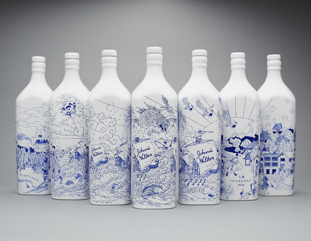
I found this very interesting project on Behance were he experimented with how far he could expand a logo before it becomes unrecognisable. I found this fascinating because it tests our recollection of these logos to the extreme by seeing how little of the logo we actually need for it to become recognisable.

https://www.behance.net/gallery/6546453/BIG-BRAND-THEORY-Experimental-Packaging-Design


The effectiveness of these cans is surprising considering that all that has been done is to crop the logo closer than you would expect. The effect makes the cans look really clean and contemporary, removing all information on the can but the logo.

I also really liked how he has rated the cropability of each of the logos. It just goes to prove that if a logo or brand is advertised enough for it to be common within our society then people will be able to recognise it down to the shapes and colours it creates.

I found that the simpler the packaging is in terms of layout and colour scheme the more effective it looks. Like in this example where they have simply filled the cup with the text, just in a monochrome colour scheme, compliments the hand-drawn elements. It feels like someone could have just sat and doodled it all on the cup making it feel a lot more personal to the consumer. I think this sort of style to the packaging would be really effective on my design due to the differences in typography, compiling them together would give subtle contrasts.
Saturday, 2 April 2016
OUGD501 - Practical - Logo Interpretations
I created a sheet of well known brands and asked my peers to try and draw their logos from memory without looking on the internet. Initially I included lots of different examples as I wasn't sure which company I wanted to do in particular.
After getting some results back I found that the ones that were most successful were the first 3 logos on the sheet - Nike, Coca Cola and Apple. These logos are common within our society so everyone seems to know the general style of them. The Coca Cola results were interesting as when people were drawing their interpretations they often said that they could see the logo in their mind but the flourishes of the logo were the hardest to see. Everyone knew that it was a script logo and it was intriguing to see their memory of the logo. Here are some examples of the best results that I got specifically for the Coca Cola logo.


From these results I will try image tracing them in illustrator and see how I can incorporate this into some packaging/advertising designs.
Subscribe to:
Comments (Atom)