Wednesday 9 December 2015

OUGD501 - Study Task 7 - Triangulation

After having a look at the sources provided for this study task I decided that it would be more beneficial to use sources more relevant to my essay. I looked at Adolf Loos "Ornament and Crime" comparing his views on Modernism with Vignelli's "The Vignelli Canon". I feel like these two writers have very similar views so I am more likely to compare similarities rather than differences. 

See below my paragraph I wrote after the triangulation session:

Some people would argue that modernist principles create timeless design because ornamentation is what truly shows age. This is true in some sense, as designs created with different trends and styles instantly look aged when they become no longer fashionable. Adolf Loos writes about the modernist architecture in his essay “Ornament and Crime” suggesting that people who hold on to previous cultures are unsophisticated and basically idiotic. “The form of an object should last, that is, we should find it tolerable as long as the object itself lasts” (Loos, 1908).  This quote suggests that the form of objects should last as long as the object itself lasts. This could be applied to the design of something – the design should last as long as what it has been made for still exists. Loos theory implies that a companies logo should not change from the day it was created and even outlast the company itself, otherwise there would be no point of using a logo at all. Massimo Vignelli shows similar views to Loos in his manifesto:

“We like the use of primary shapes and primary colors because their formal values are timeless. We like a typography that transcends subjectivity and searches for objective values, a typography that is beyond times - that doesn’t follow trends, that reflects its content in an appropriate manner … We like Design that is clear, simple and enduring. And that is what timelessness means in Design.” (Vignelli, 2007)

In ‘The Vignelli Canon’ Vignelli outlines what he thinks makes designs timeless. He clearly believes in simplicity and minimalism in design and believes that this is the key to timelessness along with the colours and typography that has been used. Also through the use of primary shapes, which in fact are always relevant and find themselves being repeatedly used in design from past to present.

Monday 30 November 2015

OUGD501 - Study Task 6 - Primary Research

In this session we learnt about different methods to collect some primary research and their respective pros and cons. For the task we were asked to consider whether any primary research methods could be used for our essays. First, I need to think about what I want to find out for the essay. 

One of the main things that interests me is how logo exposure affects peoples views on them. The more exposure a logo has the less it is visually read, and it just becomes a familiar icon. I want to see if people can analyse a logo and see if saturation makes something appear timeless. 

I had already thought about doing some primary research, especially for my design piece. I was thinking of compiling a portfolio of classic logo designs vs their modernist equivalents to compare and contrast what timelessness actually means. For the actual essay itself I could show logos in a survey and see what makes the classic logos appeal to people. I would avoid asking designers because I feel like they would have some bias towards some of the logo designs. However I am not sure whether using primary research for the essay would be necessary. I feel it would confuse the argument about modernism vs saturation. 


After consulting with Simon he said that I should look at what kind of visual cultures would describe a particular era e.g. That 70s show with the bubble serif font. Would people notice this and be able to place it in a time period? I find this quite interesting and I may try it for the design work to see if I can create a logo that couldn't be placed on a timeline. 

Monday 2 November 2015

OUGD501 - Study Task 4 & 5 - Planning & Structuring an Essay

My question:

Is it possible for a logo to be timeless?


Which Academic Sources will you reference?

- Klein, N. (2000) 'No Logo'. London: Flamingo.
- Wang, S. (2011) 'Big Brand Theory'. Berkeley, CA: Gingko Press.
- Olins, W. (2004) 'On Brand'. London: Thames & Hudson.
- Hetherington, K. (2008) 'Capitalism's Eye: Cultural spaces of commodity'. London: Routledge. p.25-50
- Gobé, M. (2001) 'Emotional Branding'. New York: Allworth Press.
- Bierut, M. (2015) 'How to'. New York: Harper Collins.
- Bass, J, Kirkham, P, and Bass, S. (2011) 'Saul Bass'. London: Laurence King.


What Graphic Design will you analyse?

Logo designs by:

  • Saul Bass 
  • Massimo Vignelli
  • Michael Beirut 

Essay Map:

INTRODUCTION 
- Introducing what I will outline in the essay
- Why am I exploring logo design
- What I may learn or what my aim for the essay is

PARAGRAPH 1
- History of logo design
- How did it become a global phenomenon

PARAGRAPH 2 
- What affect do logos have on people - a friendly face to a brand?

PARAGRAPH 3 
- Compare logo theories of a couple of designers e.g. Vignelli vs Bierut vs Bass
- Does modernism values = timelessness?
- Logo recognition

PARAGRAPH 4
- Should a logo be changed that is already effective to suit a trend?
- Explore trends in logos

CASE STUDY/IMAGE ANALYSIS
- Logos then vs now
- Modernism vs Trends
CONCLUSION
- Can logos be timeless? Support this with theories and quotes

Peer Feedback – How could this Essay Map be refined / developed?

  • Question has been refined further to be more specific and will now be good to explore in detail. Interesting question.
  • Lots of sources
  • Relevant to your practice. 


OUGD501 - Logo Design - Saul Bass Logos

http://www.logodesignlove.com/saul-bass-logos


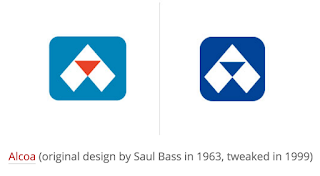
Saul Bass was one of the pioneers of design in the 1950s having already revolutionised film titles for films such as ‘Psycho’ for Alfred Hitchcock, which design will be eternally recognisable. He had been working on corporate identities since the early 1950s, but from the mid 1960s he began to work on more complex projects (Sinclair, 2014). He designed many classic American logos that we recognise today from Quaker oats and Kleenex to the Warner Communications Company. Each of these companies has pretty much stuck to his original designs. One of his most iconic quotes – a quote that I believe should be thought of whenever producing logo design – is as follows: 
“If I do my job well, the identity program will also clean up the image of the company, position it as being contemporary and keep it from ever looking dated.”— SAUL BASS


Monday 26 October 2015

OUGD501 - Study Task 2 - Parody and Pastiche

After reading the texts I wasn't sure what the exact definitions were of both parody and pastiche were so before going any further I looked up the dictionary definitions. 

Parody:

an imitation of the style of a particular writer, artist, or genre with deliberate exaggeration for comic effect.

Pastiche:

an artistic work in a style that imitates that of another work, artist, or period.


What is parody/pastiche according to each author?
In Hutcheon's text she seems to consider that parody and pastiche are the same thing. "Parody—often called ironic quotation, pastiche, appropriation, or intertextuality—is usually considered central to postmodernism, both by its detractors and its defenders" here she suggests that pastiche is simply a synonym to parody.
On the other hand, in Jameson's text he seems to believe that pastiche has indeed replaced parody completely. He writes:  "Pastiche is, like parody, the imitation of a peculiar or unique, idiosyncratic style, the wearing of a linguistic mask, speech in a dead language. But it is a neutral practice of such mimicry, without any of parody's ulterior motives, amputated of the satiric impulse, devoid of laughter" here you can clearly see that he does not believe in either parody or pastiche as a literate term. But he suggests that pastiche does not contain any of the things that parody does therefore he seems to suggest that it is pointless. 


How does parody/pastiche relate to postmodernism?
Parody and Pastiche both take examples from the past and present them in a new way. In Jameson's text he suggests that post modern designs using parody/pastiche 'cannabalize' the designs that they take inspiration from: "randomly and without principle but with gusto cannibalizes all the architectural styles of the past and combines them in overstimulating ensembles". Hutcheons states in her essay that "Postmodernism is both academic and popular, élitist and accessible" suggesting that everyone has access to old materials to pastiche from.

How does Jameson's tone-of-voice compare Hutcheon's?
Jameson's tone of voice feels a lot more like an argument than a rational essay. His tone of voice is aggressive and arrogant suggesting that he believes he is right about everything. 
Where as Hutcheon's seems more rational and thought out, written in a more academic style. She makes no reference of Jameson unlike when he almost picks on her in his essay. 

How do these concepts relate to graphic design/visual communication?
The concepts raised in the two texts show us that nothing can really be original as most design has been achieved already, it is pretty impossible to create a design without accidentally pastiching someone else's through looking for inspiration. 

Wednesday 21 October 2015

OUGD501 - Study Task 3 - Establishing a Research Question

I want to focus on the theme of Branding or Identity Design. I'm interested in specialising in this in my own practice so I thought that it would be interesting to research further into the dynamics of it.
I was thinking of something along the lines of the following questions:
- How far does branding go to sell a product?
- Is good branding needed for a successful company?


Which Of The Module Resources Does This Question Relate To?
Devereux, E. 2014 "Understanding the media"
Packard, V. (1981) The Hidden Persuaders. Harmondworth: Penguin Books
- Poynor, R. (2003) No More Rules. London: Lawrence King

Which Academic Sources Are Available On The Topic?

Here are a few books that I may research further into for this essay:
- Klein, N. (2000) 'No Logo'. London: Flamingo.
- Wang, S. (2011) 'Big Brand Theory'. Berkeley, CA: Gingko Press.
- Olins, W. (2004) 'On Brand'. London: Thames & Hudson.
- Hetherington, K. (2008) 'Capitalism's Eye: Cultural spaces of commodity'. London: Routledge. p.25-50
- Gobé, M. (2001) 'Emotional Branding'. New York: Allworth Press.
- Bierut, M. (2015) 'How to'. New York: Harper Collins.


How Could The Research Question Be Investigated Through Practice?

The response would most likely be a piece of branding in response to whether branding affects the perception of a company. Perhaps I could rebrand a good product that doesn't have successful branding already.


Tuesday 6 October 2015

OUGD501 - Study Task 1 - The Death of the Author

The overall text by Barthes is written against the Aueter theory, a theory that works of art, films, novels etc can be understood through the individual characteristics and styles of the director or author. 
"The removal of the Author (one could talk here with Brecht of a veritable 'distancing', the Author diminishing like a figurine at the far end of the literary stage) is not merely an historical fact or an act of writing; it utterly transforms the modern text (or - which is the same thing - the text is henceforth made and read in such a way that at all its levels the author absent)."
This text is showing an untold relationship between the reader and the author. That only the reader can interpret meaning from any text and that no author can provide meaning as everyone would interpret things differently. Therefore meaning is only created at the point of reading and not at the point of writing. This is the death of the author and the birth of the reader that Barthe's concludes with.
"Succeeding the Author, the scriptor no longer bears within him passions, humours, feelings, impressions, but rather this immense dictionary from which he draws a writing that can know no halt: life never does more than imitate the book, and the book itself is only tissue of signs, an imitation that is lost, infinitely deferred." 
Here, Barthes argues that no writing can ever be original because everything comes from a "dictionary" of the author's knowledge. He argues that everyone is brought up with certain knowledge of history and culture and they create this dictionary of knowledge from texts that they have read and things that they have seen, therefore their inspiration and their writings aren't original.    

The central point being to get people to engage with the world differently. It is encouraging you to challenge the dominant approach on the world. Also challenging the idea that everything has a fixed media. It is the struggle between a cultural authority's opinion and your own. 


SOCIETY


"The author is a product of our society"
This shows that to be successful an author must be accepted by society otherwise they will not be successful. Society decides the norms for everyone to follow. 


"It is thus logical that in literature it should be this positivism, the epitome and culmination of capitalist ideology, which has attached the greatest importance to the 'person' of the author."
Here Barthes shows us that in our capitalist society, the 'knowledgable' and the educated rise to the top of our social hierarchy where everyone else has to be taught by these people. Society has divisions and hierarchies where people are made to feel unintelligent in contrast to others.

References:
Barthes, R. (1968) "The Death of the Author" in: Barthes, R. (1977). "Image, Music, Text", London, Harper Collins. 

Wednesday 29 April 2015

OUGD401 - Practical Research Project - Final Design

Overall I am very pleased with this outcome as I feel that it exudes the quality of the chocolate without the packaging materials costing a lot. I also think that it is very successful at showing luxury through typographic and design choices only. 

I do feel that I could have experimented with things like foiling and embossing if I was to do this module again but I am pleased with the colours I chose to mimic gold.

I did have a few problems with the putting together of the packaging as by changing the net design from the original with the flap I miscalculated one of the edges leaving a gap at the top. But this isn’t that noticeable, it has just taught me to double check things before the final print.  


Saturday 25 April 2015

OUGD401 - Practical Research Project - Development


So after looking at more luxurious brands of chocolate I started on redesigning the Moser Roth brand. This first design was based on the design choices of the original packaging such as the colours used and wording. I feel like the white and blue clashes too much. The white background feels too empty and with black text on top it doesn’t look anything special and it doesn’t look luxurious which is my aim. I chose a serif font, again, to make it seem more sophisticated. The original packaging uses a mixture of Sans serif and serif so I wanted to limit it to one or the other. 

Based off the designs that I have researched I thought that I should try doing a design which was mostly black. I feel like the contrast of black and white is stronger, making the empty space seem less empty some how. I also added a touch of a ‘gold’ colour. I don’t want to use any fancy techniques within this design as I am keeping the target market in mind - if I make it look too luxurious people who shop at Aldi wouldn’t buy it as they would think that it is now out of their price range. So I wanted to make the design look sophisticated yet not too expensive.


After reviewing my previous design I felt as if the typeface was a bit too traditional looking and not contemporary enough for today’s market. So I found this contemporary yet still serif font to lift the design to look more modern. I also feel that this suits the origins of the brand as it has a slightly powerful German feeling to it. Yet I feel that this design is still lacking something.


Like in the Axococo design I added an accent of colour that works like a label over the black. I used a cream to represent the heritage of the brand as it was founded just under 200 years ago. I also added a small description onto the front to tempt people into buying the chocolate.


I took the mountain landscape from the original design which I think is based off the Stuttgart mountains near where the chocolate originates from. I do prefer the design with the illustration there but I feel that this illustration doesn’t suit this design. Maybe I could include illustrations that are relevant to the flavour of the chocolate (e.g. dark, milk etc.)


For the final designs I changed the illustration to something relevant to the flavour - so for milk it is a jug of milk and for dark it is cocoa beans. I feel this works a lot better as it draws your eye down the label rather than across it. I also added the nutritional values per serving onto the front like on the original packaging to make it look like the real packaging.

Additionally I put together the design of the back, keeping in mind that the design before was very cluttered I wanted to limit the information as much as possible and just keep the essential parts. I feel that the front and the back tie together nicely as they use the same label effect and elements of the gold. I personally much prefer this back design to the original. I could have utilised the rest of the black space at the bottom of the packaging but I feel that this works better as it corresponds with the front design. 


I also created a new wrap for the chocolates (as Moser Roth comes as 5 individually wrapped pieces). Once again taking elements from the design of the front I wanted to use the cream band with a black outer. I didn’t want to overcomplicate the wrapping as it will be thrown away so I just used the logo and nothing else. Any more information would have been unnecessary. 

Friday 17 April 2015

OUGD401 - Practical Research Project - Revision of Practical Ideas

After having a critique for my initial ideas a lot of people said that having a neutral packaging was kind of pointless as it probably wouldn't sell due to it not having anything special about it to make people buy it. So I decided to come up with another idea that would represent my essay better, playing on consumers perception of quality. 

I looked again at my case study and decided that I should rebrand one of the chocolates that I used to represent what kind of reception it got. I was tempted to brand Lindt to look cheap and most people thought that this was the chocolate that tasted the least expensive. But I thought that this wouldn't be appropriate as I am trying to display that packaging can make people think that the product will taste better than it actually is due to the packaging alone. So I decided to go for one of the chocolates that scored highly and I chose Aldi's luxury brand Moser-Roth. I started researching the brand and found that it had quite an interesting heritage and it was it's own company before Aldi took it over in 2007. 


The History of Moser-Roth

The company was founded in 1841 by pastry chef Wilhelm Roth Jr. in Stuttgart. In 1876 Roth retired from the company and the small factory was taken over by Wilhelm Wagner and Kommerzienrat Sproesser. In 1881 the company moved to larger premises.

In 1896 Moser merged with its Stuttgart competitor E. O. Moser & Cie, which had been founded in 1846 by master confectioner Eduard Otto Moser (1818–78).

The brand name Moser-Roth was registered in 1902. Moser-Roth was the largest chocolate factory in Stuttgart in the 20th century, around 1910 employing as many as 550 people. Other chocolate companies in Stuttgart at the time included Eszet, Haller, Waldbaur, Schoko-Buck, Friedel and Ritter, of which only the last is still in existence.

Early in 1942, the company was shut down for political reasons by the German government. In September 1944, the entire factory burned down in an air raid.

Karl Haller of Stuttgart acquired the Moser-Roth brand name in 1947 and in 1948 resumed production in the Obertürkheim section of the city. After his death the Haller company was acquired byMelitta; chocolate production continued until 1967, after which the Moser-Roth brand name passed through various owners, being finally sold to Storck. Since June 2007 Storck has produced chocolate for Aldi at Moser-Roth GmbH, located in the Berlin borough of Reinickendorf. Moser-Roth is Aldi's premium brand of chocolate; it received an award from the German Agricultural Society in 2007.


THE CURRENT PACKAGING


The current packaging is created to appeal to people who shop at Aldi therefore it is made to look sort of expensive and luxurious, but not too much to put people off. I want to recreate this packaging so that it looks how people thought it tasted - like a really expensive chocolate. But I also want to produce this by using cheap methods, so it could still be produced cheaply and be able to be sold for the same price, it would just look better and hopefully reflect how people tasted it in my case study.

I went back to the drawing board and decided to sketch some ideas rather than go straight to digital this time. I was stuck between using a script typeface or a serif one to represent the quality of the product. By the side I also played around with monogram logo ideas however I realised that the combination of M and R made mister and would probably be read wrong  and not as a chocolate brand. 


The back of the packaging design I feel is very cluttered and I particularly don’t like the bar code going across the whole of the back.


Saturday 4 April 2015

OUGD401 - Practical Research Project - Luxury Chocolate Research


I like how this design is dominated by black a part from  the label where all the information is. Gold and pink accents have been used really effectively to lift out of the dark black and add more sophistication to the packaging. There is also subtle spot varnishing on the bottom of the packaging, although it is so subtle that I feel that it is not needed. The layout of the label itself is laid out in a really nice way - I feel that the hierarchy of the type is just right and the use of a simple illustration lifts it all. I feel like most of the sophistication of this packaging however comes from the typographic treatment. This shows that you can create a packaging that looks very expensive and glamorous for not much cost at all.

This very modern take on chocolate packaging combines pastel shades with contemporary geometric patterns to create a very sophisticated look. I like the use of blocks of black or white to frame the important information making the patterns do all the ornamentation. This particular brand was inspired by Japanese designs and was itself meant to be a japanese brand. From all of the designs that I have chosen to analyse black has been a dominant colour. I feel this is because black connotes sophistication, dominance, power and authority which creates an overall feeling of quality and stability. 


I started by looking at more expensive or luxury brands of chocolate. I found this brand Marou which uses metallic gold inks and contrasts it would blacks to give a very expensive look. It feels very exotic with Chinese styled illustrations and bright patterned background.  I think that there has been some embossing employed within the illustration on the packaging and techniques such as this will definitely make a product look more elegant and therefore better quality. I do really like the contrast between the black and gold within this packaging and I think that limiting the colour scheme makes a product seem more sophisticated which I feel this product lacks slightly.