Saturday 6 December 2014

OUGD401 - Essay Rethink

After having a tutorial to talk about my essay plan structure and though I wanted to focus the essay on obsolescence, this wouldn't be possible as it avoids the question that I chose entirely, so I am back to square one. It was suggested that I could focus on branding and their sustainability. I do like this idea but then I can't see how I can link this to the relationship between consumers and brands. He also suggested that I looked at the Google Ara phone, which I found a video about below, which focuses it's efforts on a phone with interchangeable parts to upgrade whenever you want. This would reduce electronic waste massively.


So I had a rethink and looked back at my initial ideas and decided to go with food branding. I think that I will research perceptions of brands and how some products could be exactly the same in terms of taste but the packaging could make it seem more expensive. For example there is often not much difference in the taste of basics own brand custard creams for 35p, compared to their other custard creams for 65p. 


Although I am not sure whether I should focus on a specific product, or most foods in general. I thought that I could maybe focus on chocolates (considering I love chocolate) and design either high end, low end or a neutral packaging. 

 I feel more comfortable doing this because I enjoying looking at packaging and in previous projects I have made some food packaging. I love the hands on approach to creating paper packaging so I think that it will work well for me. 

Wednesday 3 December 2014

OUGD401 - Interactionism Theory - Consumerism research

Interactionism in sociology is a theoretical perspective in which society is thought to be a product of the everyday social interactions among millions of people. Instead of looking at social systems at a larger-scale, such as the entire population of a country or third world countries, interactionism focuses on smaller-scale social interactions, such as the interactions between individuals or small social groups. George Herbert Mead, Max Weber, and Herbert Blumer have all made several contributions to the interactionism theory.

Interactionism in sociology focuses on the way that we act, or make conscious choices regarding our behaviour that proceed from how we interpret situations. In other words, humans are not simply reacting to social stimuli: we are 'social actors' and must adjust our behaviour based on the actions of other social actors.

Interactionism in sociology examines how different social actors make sense of or interpret the behaviour of those around us. This information can be used to understand the social construction of the world, which is focused on not only the meanings that we give to behaviour, but also how we interpret the meanings of behaviour.

For example, suppose that we were driving along a road when a truck speeds by us going 20 miles per hour over the speed limit. We would interpret that behaviour as wrong and illegal since the car was breaking the speed limit. Now let's say that we heard a siren and saw that the truck was actually a red fire truck going to put out a fire. Then we would interpret this behaviour as acceptable given that the fire truck has a good reason for breaking the speed limit.

Interactionism is also concerned with the social context in which our interactions take place. The social context not only plays an important role in the way in which we interpret others' behaviour, but also how we choose to behave ourselves at any given moment.


So this can be applied to consumerism as we often act as a group or label ourselves with a trend when buying certain product. So it compels people to buy something based on who owns it rather than the consumers needs. For example if a celebrity had a certain brand of clothes, his/her fans would want to have the same brand of clothes, even though they probably don't need them. 

Monday 10 November 2014

OUGD401 - Study Task - Made to Break: Technology and Obsolescence in America

Summary of the first chapter of "Made to Break: Technology and Obsolescence in America" by Giles Slade.

REPETITIVE CONSUMPTION & BRANDING.

Before mass production became a universal term in the 1950s, businessmen worried about over-production - they wanted to avoid it by selling more and not producing less. As the economy changed to machine-driven industry, it came to light that manufacturers could produce more goods than they could sell. 

50 years later, King Champ Gillette ( the inventor of the disposable razor ) considered overproduction to be America's biggest problem stating that: 
"We have the paradox of idle men, only too anxious for work, and idle plants in perfect conditions for production, at the same time that people are starving and frozen. The reason is overproduction. It seems a bit absurd that when we have overproduced we should go without. One would think that overproduction would warrant a furious holiday and a riot of feasting and display of all the superfluous goods lying around. On the contrary, overproduction produces want."
As manufacturers thought about solutions to this dilemma they decided that the problem was twofold. The first problem was demand - creating it and sustaining it. The next was distribution - moving goods quickly and cheaply to consumers. From the late 19th century onwards the problem was confronted through the development of highways and cheap freight on railways.

While retailers developed their distribution networks, manufacturers tackled their lack of demand by developing marketing campaigns. Advertising played a huge role here, but the manufacturers puzzled on what they should advertise about their goods. This was before consumer advertisements became effective in creating demand for a product, the product first had to become different from similar goods. 

A good example of this was Uneeda Biscuits. Their goal was to create a need for repetitive consumption of their product by consumers to relieve overproduction. In 1899 the National Biscuit company, makers of Uneeda biscuit, began to feature its patented In-Er-Seal packaging in a national ad campaign to create demand for their product. Before this, people would buy their biscuits in bulk from an open barrel in their local shop. National Biscuit emphasised that their packaging prevented moisture from ruining the quality and flavour of their biscuits. They supported this with a graphic that depicted a boy in a yellow rain coat pushing a wheelbarrow full of biscuit boxes home in the rain. Eventually the boy became the mascot that appeared on all of Uneeda biscuit's packaging and customers started to ask for the biscuits by name. They had successfully created enough demand to guarantee repetitive consumption. 

Branding has become a good solution to stop overproduction and create repetitive demand. It gave customers a direct relationship between them and the company they bought goods from. Wrigley's, the American Tobacco Company and Procter & Gamble all adopted similar tactics to gain product loyalty amongst their customers even before the Uneeda campaign. They all designed strong national advertising campaigns not just to identify their branding but also to provide guarantees of quality. These guarantees were needed for early packaged products as many customers were suspicious of any goods that they could test or taste.  

Modern packaging, with trademarks and identifying logos, guaranteed to the customer a consistency in quality therefore being safe for them to buy. As these products were being distributed nationally, brand names assured customers of an equitable value for money exchange at any store in the country. 

Christine Frederick observed in 1919 that:
"The one means of protection the consumer can rely on is the 'trademark' on the package or the product she buys... In every case, the trademarked brand carries more integrity or guarantee."
This truly defined the start of an era where customers were comfortable with branding and even made loyalties to them.

Bibliography
Slade, G. (2006). 'Made to break'. Cambridge, Mass.: Harvard University Press.

Wednesday 5 November 2014

OUGD401 - Study Task 3 - Consumerism Mind Map & Hypothesis


We had to create a mind map that had all we could think of about consumerism. We then shared our ideas with other people doing the same question. I learned that things like "2 for 1" offers are often just tactics for companies to make you buy more. Also I learnt that consumerism is used to refer to overconsumption of goods that consumers don't need.

HYPOTHESIS
Though the relationship between consumers and branding is a very close one. Without branding most companies would struggle to sell enough. However, I believe that there are many other factors involved in the relationship between brands and consumers. One of the main factors that increases consumption is obsolescence, whether it be planned or just due to technology. Also, novelty and technological advancement plays a huge factor in what consumers buy, for example if a individual had a computer, it would become obsolete very quickly due to better technology being invented. This urge to consume in our society is unhealthy and it could be costing the planet as well as ourselves. 

Saturday 1 November 2014

OUGD401 - Consumerism - What is the relationship between branding and The Consumer Self (Ewen)?

I decided to choose the question on Consumerism for my essay as I am very interested in both the idea that branding affects peoples opinions on products and that some brands use built in obsolescence in order to make more sales.

In the interim critique I was told that both were good ideas however I should focus on just one aspect. So I went to the library and found a book called "Made to break", all about the invention of obsolescence and how it has effected us as a society as well as the environment. I found it very interesting how much impact that has had on the environment already. For example with the invention of LCD screen cathode ray tube screens were simply thrown away and the cathode gas could have leaked into the water systems from the landfill. I find this quite concerning along with this "throw away culture" that we live in today. So I also got a book out that talks about the second hand culture that is present in some countries, which makes a lot more sense than throwing things away. Like with furniture, often vintage and old furniture is a lot sturdier than most furniture that people buy today like flat pack furniture so it makes sense to reuse old furniture and update it. I myself have gone with the up-cycling movement and I have bought old furniture in my room and painted to make it look more modern. 

So I think for my essay I will write about:

  • Who created obsolescence and why?
  • What companies and brands use obsolescence?
  • What effect does obsolescence have on the environment?
  • Primary research on consumers knowledge about obsolescence.
  • My opinion on obsolescence.
  • How to tackle obsolescence.
I also have had the idea to rebrand an up-cycling company as my body of work or even create a promotional campaign demoting obsolescence.

Wednesday 15 October 2014

OUGD401 - Study Task 2 - Modernism and Post Modernism

MODERNISM

Anton Stankowski - Mercedes Benz Racing - 1955

Anton Stankowski's work displays the epitome of the modernist movement within graphic design. Most of his work uses simple type and image to portray his message but with not much else on the page. I find his style of design so striking, especially for this piece of advertising done for Mercedes Benz in 1955. The whole poster conveys movement and speed which is exactly the message that Mercedes will have wanted to portray. He also uses no information whatsoever within the design, just simple text and image. Although there is so little within the design this makes it more effective. The bold eye catching colours draw your eyes into the piece and the chevron points you in the direction of the race car and gives the illusion that the car will carry on moving. I also believe that the colours used in the image are very patriotic to Germany, with the combination of black and yellow selling the idea that Germany and therefore Mercedes makes the best race cars. 

POST-MODERNISM

i-D Magazine cover - Terry Jones - 1980

This i-D magazine cover is also very post-modern. The colour scheme and layout screams chaos and anarchy, very reminiscent of the punk style. The class of the bold colour really shocks the viewer, in my personal opinion I find it a bit of a sickly combination. It is a complete contrast to the simplicity and small colour palette used in Stankowski's piece. Even the typeface used is varied in size and varies in upper and lower case, further emphasising the idea of disorder. 


Thursday 9 October 2014

OUGD401 - Study Task 1 - Image Analysis

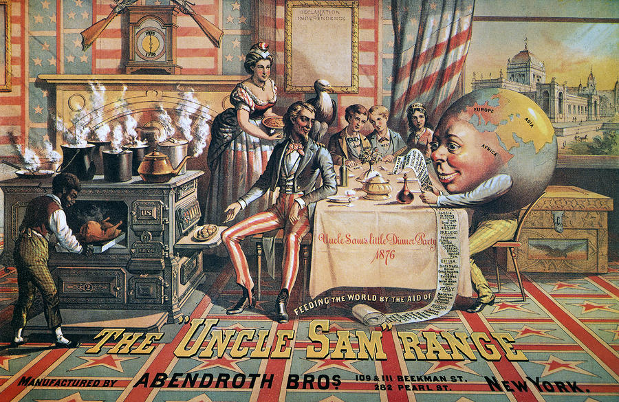
'The Uncle Sam Range', 1876, Schumacher & Ettlinger. 


'Daddy, what did YOU do in the Great War?', 1915, Savile Lumley.

Both of these images were created at very different points in history yet they still share a similar message. They both are aimed at middle or upper class men who want to strive to be better as in Schumacher and Ettlinger’s image the scene that they have set is one of wealth, and the fact that they have a slave also suggests that they are a high class family. With Lumley’s image the family is very well dressed in a comfortable setting implying that they are a middle class family.

The Uncle Sam Range piece is an advertisement for a range cooker. This isn't an average advert, as you would expect the range to be in the centre of the image, with everything else revolving around it. However, we are drawn to Uncle Sam who sits in the centre with an eagle on his shoulder. He represents the epitome of American patriotism, as the eagle is America’s national symbol and Uncle Sam played a huge part in the civil war in 1812 suggesting perhaps that with this cooker the man of the house can become an ideal American and therefore buying into the idea of the American dream of power and riches. The overall look of this image is patriotism, with the stars and stripes and red and blue colour scheme it jumps out the page at you. This is especially pertinent at the time this advertisement was released, as it was the 100th anniversary of American Independence so patriotism was at an all time high.  Lumley's piece also represents strong patriotism but in a more subtle way which is definitely more 'British'. There is a fleur de lis pattern on the armchair, which is on most pound coins, and there is a red rose pattern on the curtains, which also represents England. Additionally Schumacher and Ettlinger's image seems to berate other countries that aren't America. Looking closely at the image the bill of the meal makes racist remarks about what other countries eat, for example under Ireland there is a range of different cooked potatoes (even raw!) suggesting that America is the best country in the world. It proposes to the audience that if you own this cooker than you can feed the whole of America and the world.

The cursive font used on the dinner cloth is very extravagant suggesting that they are indeed dining in luxury. Plus the font used in the title of the advert is a bold slab serif, signifying power as this type of font is often used in Western films, often showing the power of American’s and how they cleaned up the American land to use for themselves. Once again this buys into the American dream and suggesting this cooker will help you gain power and wealth. Similarly, the font used in Lumley’s connotes a message, it has a hand written style makes the poster look more intimate, especially combined with the illustration which looks like we are watching in on a family setting. Also it could belong to the handwriting of the girl as she is looking at her father, suggesting it is her asking him the question. The capitalisation of the ‘you’ in this image conveys a very strong message and shocks the viewer out of the intimate setting and takes the question to you rather than to the father in the image. This is emphasized by the uncomfortable glare of the father at the viewer. Moreover, the cold colour of the girl’s dress compared the warm colours of the boy and father’s outfits in Savile Lumley’s image clicks into the gender stereotypes of the time. Women during the First World War often shunned men who didn’t join the army and would often publicly shame them. So the cold colour used in the girl’s outfit and even her expression suggests that she is almost criticizing her father and even hurting his pride. The whole aim of this poster is to play on men’s pride and suggest to them that they are not a real man or even that they aren’t protecting their family and embarrassing if they don’t join the army. Gender stereotypes are also used very subtly in Uncle Sam’s Range Cooker with the man being the centre of attention sat at the table and the woman serving everyone, in the background.


Overall I feel as if both of these pieces of graphic design are selling something to the viewer. For the first image it is selling the cooker with the idea that the American dream comes with it. With Lumley’s image it is selling asking you to sell yourself for your country and at the same time selling the idea that you will do well for yourself if you join the army.

Tuesday 7 October 2014

OUGD401 - Modernism - Jan Tschichold

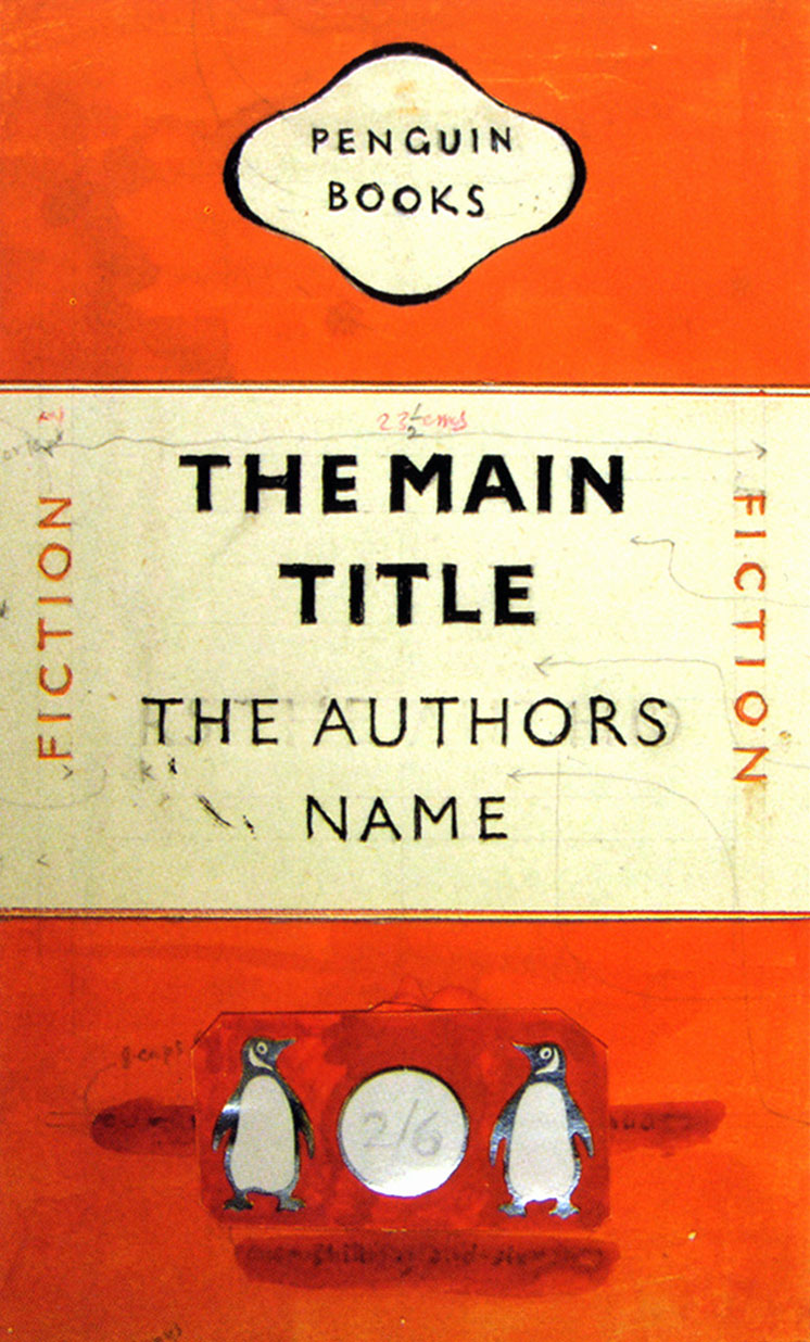
After todays lecture I wanted to learn more about Modernism so I researched more into Jan Tschichold. He was very much a pioneer of 20th century typography and he even worked closely with Paul Renner. Unfortunately, the Nazi's seized most of his work when he fled Germany as his work with sans serifs was "deemed a threat to the cultural heritage of Germany". One of his most well known works was standardising the design for Penguin Books covers. Below is his original design draft. It shows the epitome of the modernist movement - limited colours, sans serif text and only a few images. It just shows the bare essentials of what a book cover needs. I really like the use of the punchy orange as your eye is immediately drawn to the white space where the title and the name of the author is. However, it does slightly remind me of a train ticket. 


What I find particularly interesting is that Tschichold learnt scriptwriting at an early age and was very skilled in calligraphy, yet in later life he completely rejected any typeface that wasn't sans serif. His complete change in attitude may have been when he visited a Bauhaus exhibition in 1923 as in 1924 he created this poster for a publisher.


It is a complete change from his early calligraphy work designed in 1919:


I find this drastic change in style very inspiring as it shows that anyone can change their style, arguably, to one that is much better. I like how in his newer poster doesn't follow traditional rules and how the text is all on jaunty angles, there isn't once piece of text that is level. This makes the viewer look at the poster for a longer so they can read all the information given.