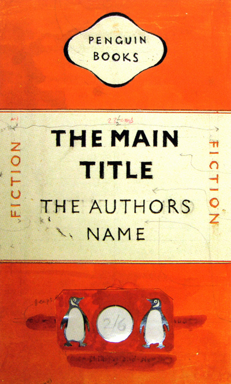
After todays lecture I wanted to learn more about Modernism so I researched more into Jan Tschichold. He was very much a pioneer of 20th century typography and he even worked closely with Paul Renner. Unfortunately, the Nazi's seized most of his work when he fled Germany as his work with sans serifs was "deemed a threat to the cultural heritage of Germany". One of his most well known works was standardising the design for Penguin Books covers. Below is his original design draft. It shows the epitome of the modernist movement - limited colours, sans serif text and only a few images. It just shows the bare essentials of what a book cover needs. I really like the use of the punchy orange as your eye is immediately drawn to the white space where the title and the name of the author is. However, it does slightly remind me of a train ticket.
What I find particularly interesting is that Tschichold learnt scriptwriting at an early age and was very skilled in calligraphy, yet in later life he completely rejected any typeface that wasn't sans serif. His complete change in attitude may have been when he visited a Bauhaus exhibition in 1923 as in 1924 he created this poster for a publisher.
It is a complete change from his early calligraphy work designed in 1919:
I find this drastic change in style very inspiring as it shows that anyone can change their style, arguably, to one that is much better. I like how in his newer poster doesn't follow traditional rules and how the text is all on jaunty angles, there isn't once piece of text that is level. This makes the viewer look at the poster for a longer so they can read all the information given.


No comments:
Post a Comment