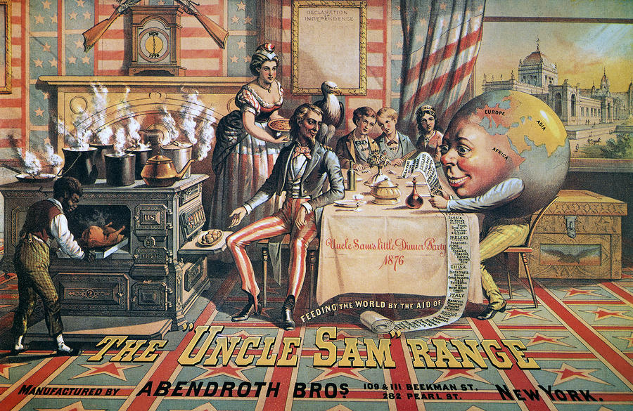
'The Uncle Sam Range', 1876, Schumacher & Ettlinger.
'Daddy, what did YOU do in the Great War?', 1915, Savile Lumley.
Both of these images
were created at very different points in history yet they still share a similar
message. They both are aimed at middle or upper class men who want to strive to
be better as in Schumacher and Ettlinger’s image the scene that they have set
is one of wealth, and the fact that they have a slave also suggests that they
are a high class family. With Lumley’s image the family is very well dressed in
a comfortable setting implying that they are a middle class family.
The Uncle Sam Range
piece is an advertisement for a range cooker. This isn't an average advert, as
you would expect the range to be in the centre of the image, with everything
else revolving around it. However, we are drawn to Uncle Sam who sits in the
centre with an eagle on his shoulder. He represents the epitome of American patriotism,
as the eagle is America’s national symbol and Uncle Sam played a huge part in
the civil war in 1812 suggesting perhaps that with this cooker the man of the
house can become an ideal American and therefore buying into the idea of the
American dream of power and riches. The overall look of this image is
patriotism, with the stars and stripes and red and blue colour scheme it jumps
out the page at you. This is especially pertinent at the time this
advertisement was released, as it was the 100th anniversary of American Independence
so patriotism was at an all time high. Lumley's piece also represents
strong patriotism but in a more subtle way which is definitely more 'British'. There
is a fleur de lis pattern on the armchair, which is on most pound coins, and
there is a red rose pattern on the curtains, which also represents England.
Additionally Schumacher and Ettlinger's image seems to berate other countries
that aren't America. Looking closely at the image the bill of the meal makes
racist remarks about what other countries eat, for example under Ireland there
is a range of different cooked potatoes (even raw!) suggesting that America is
the best country in the world. It proposes to the audience that if you own this
cooker than you can feed the whole of America and the world.
The cursive font used on
the dinner cloth is very extravagant suggesting that they are indeed dining in
luxury. Plus the font used in the title of the advert is a bold slab
serif, signifying power as this type of font is often used in Western films,
often showing the power of American’s and how they cleaned up the American land
to use for themselves. Once again this buys into the American dream and
suggesting this cooker will help you gain power and wealth. Similarly, the font
used in Lumley’s connotes a message, it has a hand written style makes the
poster look more intimate, especially combined with the illustration which
looks like we are watching in on a family setting. Also it could belong to the
handwriting of the girl as she is looking at her father, suggesting it is her
asking him the question. The capitalisation of the ‘you’ in this image conveys
a very strong message and shocks the viewer out of the intimate setting and
takes the question to you rather than to the father in the image. This is
emphasized by the uncomfortable glare of the father at the viewer. Moreover, the
cold colour of the girl’s dress compared the warm colours of the boy and
father’s outfits in Savile Lumley’s image clicks into the gender stereotypes of
the time. Women during the First World War often shunned men who didn’t join
the army and would often publicly shame them. So the cold colour used in the
girl’s outfit and even her expression suggests that she is almost criticizing
her father and even hurting his pride. The whole aim of this poster is to play
on men’s pride and suggest to them that they are not a real man or even that
they aren’t protecting their family and embarrassing if they don’t join the
army. Gender stereotypes are also used very subtly in Uncle Sam’s Range Cooker
with the man being the centre of attention sat at the table and the woman
serving everyone, in the background.
Overall I
feel as if both of these pieces of graphic design are selling something to the
viewer. For the first image it is selling the cooker with the idea that the
American dream comes with it. With Lumley’s image it is selling asking you to
sell yourself for your country and at the same time selling the idea that you
will do well for yourself if you join the army.